
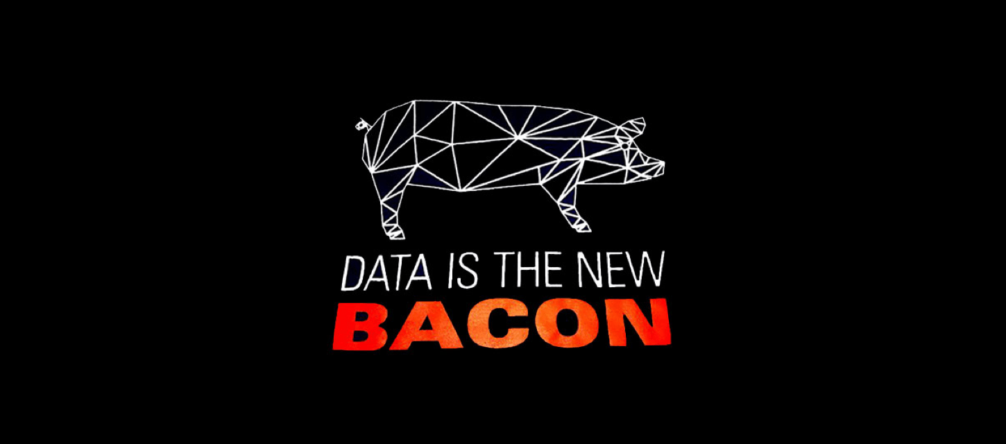
Repeat after us: “Spreadsheets are not data visualizations.” Spreadsheets that try to convey the story behind your data are like two-day-old donuts: STALE.
Contemporary whiteboard art, confusing graphs, and boring pie charts need to (Van) Gogh away for good too! They should all be replaced with software that allows you to create engaging visual representations of your data. Are we right, or are we right?
Datalabs defines the trinity of data visualization as data analysis, storytelling, and design, but how are companies using this approach — and the software that powers it — to drive success?
FROM DATA TO DATA VISUALIZATION
Historically, data was often presented in dull, seemingly never-ending spreadsheets containing figures that were often confusing and difficult to process or convert to actionable insights. Enter data visualization tools — the solution to spreadsheet-induced coma and death-by-PowerPoint that has revolutionized how companies communicate their data findings.
Forrester previously declared that insight is the new data, and this holistic attitude to gathering and interpreting data through individual team collaboration is exactly the way that all industries need to think in order to harness the potential of data at their fingertips.
The sky really is the limit when it comes to data visualization! Alaska Airlines has long been at the forefront of innovation in aviation, especially when it comes to relying on data to make critical decisions for ground and in-air operations. For example, the airline uses data to calculate, analyze and optimize operational processes — from taxi times to codeshares with other airlines — and address various challenges, such as the task of creating paperless flight decks across their fleet.
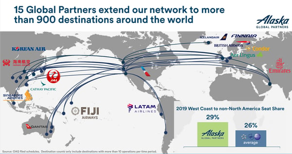
By incorporating Tableau data visualization software, Alaska can organize their data to identify emerging trends and modify these processes more cost-effectively. The ability to present collected data in ways that make it accessible and easily understandable to internal stakeholders has helped Alaska forge ahead with their plans for growth and further innovation, and data visualizations has played a major part in this.
IS YOUR BUSINESS PROACTIVE OR REACTIVE?
Collecting, analyzing and utilizing data correctly not only has the power to provide a 360º view of productivity and processes, but also it allows you to use data analytics for predictive maintenance and implement cost-saving initiatives before any potential problem occurs. This proactive approach is a must for any business who wants to thrive well into the future. Reacting to incidents, such as process failures or health and safety concerns “after the horse has bolted,” only adds insult to injury — especially if the data is already there, waiting to be collected.
If your business is using a life-cycle costing model to drive efficiency, you’ll understand how the quality of the data extracted from each stage of the cycle directly influences decisions made. Activity-based costing is one such proactive approach that was used by E.ON Energie. The German power and utility supplier tasked each department with allocating costs to their respective processes and documenting these in user-friendly data visualization software; which made the data easier to export and segment, and also provided multi-dimensional perspectives on individual process levels. The results of this approach enabled E.ON to aggregate costs in specific categories and implement cost-saving initiatives as required.
BUSINESS INTELLIGENCE AND ANALYTICS FOR THE WIN
Raw data simply doesn’t provide the complete story needed to make the best data-driven business decisions. As companies move toward a more collaborative, cross-departmental approach, the ability to interpret and present data in a clear, relatable way has become a crucial part of day-to-day operational processes. That’s why the data visualization capabilities of Business Intelligence (BI) platforms, such as PowerBI and Tableau data visualization, are being used as rocket fuel to propel intelligent process automation to new heights.
Here are some of the ways that visual representation of data can improve your operational processes:
– Provides perspective: Seeing the true scale of an issue, or the impact of a project, allows your team to gain a better understanding of the global significance and value of their work. What are some examples of how data visualization improves decision making? Think of an image of a world map with the locations of your customers highlighted on it; it will give your team a more “real” perspective of how far-reaching the company’s footprint is; which can help to foster a shared understanding of the company’s strategic plans.
– Clear, understandable information communicated between all teams: Data visualization allows you to tell the story of how what you have identified from collected data will help all teams to work together to reach the overall goals of the business. It also illustrates how their individual contributions impact the bottom line. This reinforces the common goals that exist between all teams, which encourages and fosters collaboration.
– Where’s the love? The passion and the drive to reach the company’s goals need to permeate the very fiber of the business, in order to keep teams motivated to be as productive as possible and keep working toward the company’s goals. Data visualization allows you to convey the heart of your business through emotive, engaging images, and illustrations.
– Transparency and accountability: Data dashboards can provide real-time information and constant visual representation of KPIs or other relevant data. This transparent approach to productivity management gives your team’s autonomy and visibility to see the impact of teamwork, which can increase productivity and increase morale.