You know that moment in a meeting when someone asks, “So how are we actually doing on inspections this month?” And someone is starting to scramble to pull a spreadsheet together.
That’s the moment we built the Fluix Dashboard for.
In this guide, I will walk you through what Dashboard does, how to set one up, and what we’ve seen customers actually use it for.
Note: Dashboard is available under the CREWS plan. Compare Fluix plans on our pricing page to view all available features.
What is Fluix Dashboard?
Dashboard is a real-time reporting feature inside Fluix’s inspection management software that visualizes data from your inspections, forms, and workflows. So ops and safety teams can see status, KPIs, and findings at a glance.
It pulls data from the inspections your field teams are already submitting and turns it into Cards (for headline numbers), Charts (for trends and comparisons), and a Table (for the actual records behind the numbers).
A few things worth knowing up front:
- It’s live. As soon as a field engineer submits an inspection on their phone, the numbers update.
- It’s flexible. You can build multiple dashboards for different teams, sites, or use cases.
- It’s shareable. You can send a Board to a colleague, export it as CSV or XLS, or push the data out via API.
What Problem Dashboard Solves
Most businesses aren’t short on inspection data. They’re short on a way to see it without building an inspection report from scratch every time.
Dashboard solves five specific problems we hear from customers:
1. You can’t see inspection status across multiple sites or teams in one place.
Inspection data lives inside individual reports, forms, and PDFs. There’s no single screen showing what’s complete, what’s in progress, and what’s overdue across the operation.
Dashboard puts all of it on one screen, filtered by site, team, project, or time period.
2. Bottlenecks and overdue items go unnoticed until they become incidents.
Without a live view, an overdue safety inspection at one site can sit unflagged for weeks. Dashboard updates the moment a field team submits an inspection, so overdue items, stalled corrective actions, and recurring failures surface immediately.
3. Weekly reports get rebuilt from scratch every week.
Most teams export form data into a spreadsheet, format it, chart it, and send it on. Every Monday. Dashboard replaces that workflow with a saved Board you build once and reuse — the numbers update on their own.
4. Leadership requests take hours to assemble.
“How are we doing on inspections this quarter?” usually triggers a half-day of data wrangling. With Dashboard, the answer is already on screen.
5. Audit prep eats days of manual review.
Finding inspections with missing sign-off, expired certifications, or open findings means scrolling through reports one at a time. A Dashboard filtered for audit-readiness compresses that work into a single view.
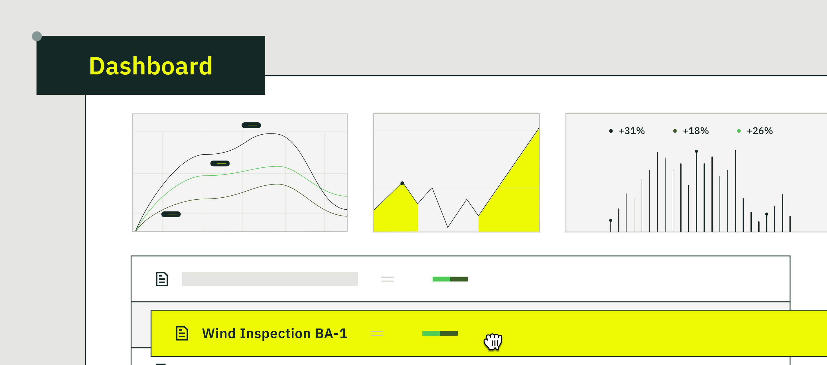
What’s Inside a Fluix Dashboard
Every dashboard in Fluix is built from three building blocks. You can mix and match them depending on what you need to see.
Cards (the headline numbers)
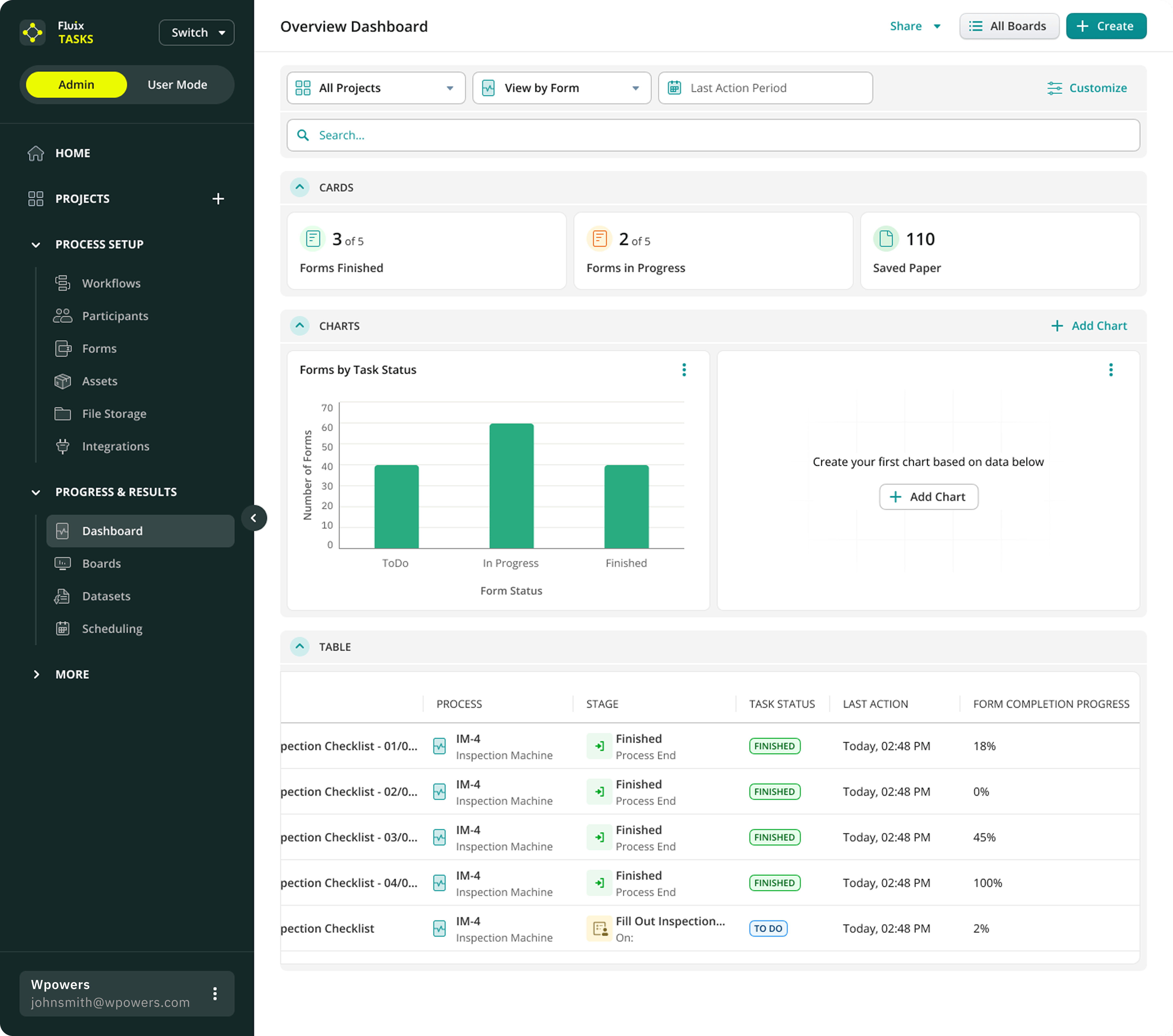
Cards are the big-number tiles at the top — the quick-glance KPIs. The default dashboard ships with three:
- Forms Finished — how many inspections your team has completed
- Forms in Progress — what’s currently being worked on
- Saved Paper — a count of sheets you’d have printed if you were still doing this on paper (small thing, but in our data, this is the card most customers screenshot for sustainability reports)
You can think of cards as the answer to “what’s the headline?”
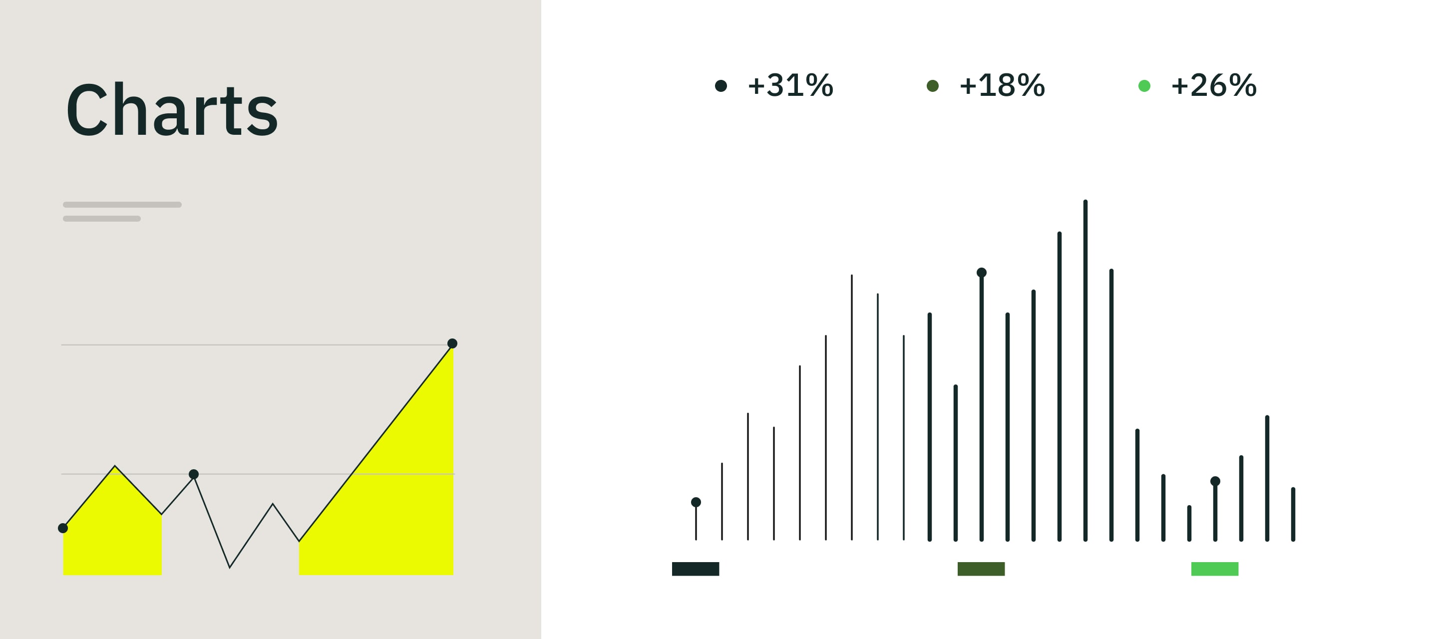
Charts (the patterns)
Charts are where trends and comparisons live. The default chart most teams start with is Forms by Task Status — a bar chart showing how many inspections are in To Do, In Progress, and Finished at any given moment.
From there, you can add more charts to answer questions like:
- Which sites are completing the most inspections?
- How is one team performing compared to another?
- Are findings trending up or down month over month?
- Where are corrective actions piling up?
Click + Add Chart and pick your data source. That’s the whole setup.
Table (the underlying records)
Below the cards and charts is the Table — the actual list of inspections behind those numbers. For each form, you can see:
- The inspection (e.g., Inspection Checklist – 04/IM-4)
- The Process it belongs to (e.g., Inspection Machine)
- The current Stage (e.g., Finished – Process End, or Fill Out Inspection – On: [assignee])
- Task Status (Finished, To Do)
- Last Action timestamp
- Form Completion Progress (0%, 45%, 100%)
This is where Dashboard stops being abstract. You see the chart, you spot something odd, you scroll to the table, and there’s the actual inspection that needs your attention. No second tool, no separate query.
How to Set Up Your First Dashboard
The good news: there’s already a default Overview Dashboard waiting for you when you open the feature. The better news: customizing it is a five-minute job. Here’s the flow.
1. Open Dashboard from the sidebar
In your Fluix workspace, click Progress & Results → Dashboard in the left-hand menu. You’ll land on the default Overview Dashboard with Cards, Charts, and a Table already populated from your existing inspection data.
2. Pick the data you want to see
At the top of the dashboard, you’ve got three filters:
- Projects — choose all projects, or narrow to one (e.g., Solar Energy Performance)
- View by — toggle between Form or Processes.
- Last Action Period — set the time window (last 7 days, last month, custom range)
Set these once and the entire dashboard — Cards, Charts, Table — re-filters in place.
3. Add charts that answer your questions
Click + Add Chart, choose a data source (forms, processes, assignees, assets), pick a chart type (column, bar, line), and (optionally) decide what to group by. If you want a chart showing overdue safety inspections by site, last 30 days, you’d filter forms by safety inspection type, or group by site. Save it. Done.
You can add as many charts as you need — most teams settle on three to five per dashboard.
4. Save it as a Dashboard
Once your dashboard looks the way you want it, save it as a Dashboard you can come back to anytime. The screenshot example, Solar Energy Performance, is a Dashboard built for one specific project — a safety lead can open it once a week and have everything they need without rebuilding a single chart.
Most ops teams end up with a handful of dashboards: one per region, one per inspection type, one for the weekly leadership update.
What Inspection Teams Use Dashboard For
These are the five use cases we see most often in our customer base. They’re not hypothetical — they’re patterns we tracked across construction, renewables, and manufacturing accounts before and after Dashboard shipped.
Site safety inspection monitoring
A safety manager overseeing 14 sites builds a Dashboard showing weekly safety inspection completion per site, plus a chart of open findings and overdue corrective actions. Sites trending red get a call that day — not a follow-up email next month.
Pre-audit readiness check
Two weeks before an external audit, a compliance lead opens a Dashboard filtering for inspections with missing sign-off, expired certifications, or open findings. What used to be three days of manual review compresses into a 20-minute scroll. (One of our renewables customers reported cutting their pre-audit prep from three days to four hours after building this Dashboard — that’s the single most cited Dashboard outcome in our customer interviews.)
Equipment inspection performance
An operations director compares planned versus completed equipment inspections across crews. The crew falling behind two weeks running gets workload-balanced before equipment moves into a higher-risk window.
Spotting recurring non-compliance
A quality manager builds a chart of the five most-failed checklist items across all field inspections last quarter. Same three items, same asset type — that drives a targeted retraining instead of a generic safety memo nobody reads.
Monday morning leadership snapshot
A regional manager opens the same Dashboard every Monday at 9 a.m. before the leadership call. Inspections completed last week, current open findings, top three sites by performance. No spreadsheet, no prep.
Fluix Dashboard FAQ
What is Fluix Dashboard?
Fluix Dashboard is a feature inside Fluix that visualizes data from your inspections, forms, and workflows in real time. It shows headline numbers (Cards), trend charts, and a table of underlying records — all in one screen — so ops and safety teams can see what’s happening without manual reporting.
Who’s it for?
Mostly ops managers, safety leads, compliance managers, and team leaders who oversee multiple sites or distributed inspection teams. Field workers don’t need to interact with it directly — the inspections they submit feed the dashboard automatically.
How is Dashboard different from Fluix Charts?
Charts is the underlying chart-building capability — you can think of it as one tile. Dashboard is the whole screen: Cards, Charts, Table, filters, and Boards. If Charts is a single visualization, Dashboard is the room you put it in.
Can I have more than one dashboard?
Yes. You can create as many as dashboards you need — one per region, one per inspection type, one per client. Most teams end up with four to six.
Do dashboards update automatically?
Yes. The moment a field team submits an inspection or updates a workflow stage, every Dashboard that includes that data refreshes. No syncing, no waiting.
How do I share a dashboard outside my team?
Click Share in the top-right of any Dashboard. You can share to other Fluix users, download as an image, CSV or XLS, or push the data via API to a BI tool like Power BI or Tableau.
Does Dashboard work with data from outside Fluix?
Not directly inside the Dashboard view — Dashboard visualizes Fluix data only. If you need to combine it with external data, use the API export to push it into a BI tool like Power BI or Tableau.