In field operations, teams collect a huge amount of data. But collecting is only half the job. Turning that data into something you can actually understand and act on is where many businesses get stuck.
Fluix Charts helps you do exactly that. It turns the data already captured in your reports into visual summaries. This way, you can see what’s happening across sites, teams, and assets, and decide what to do next.
Let’s break down what Fluix Charts is, how teams use it, and how it helps you move from raw data to confident decisions.
Note: Charts are available under the Pro plan. Compare Fluix plans on our pricing page to view all available features.
Contents:
WHAT IS FLUIX CHARTS?
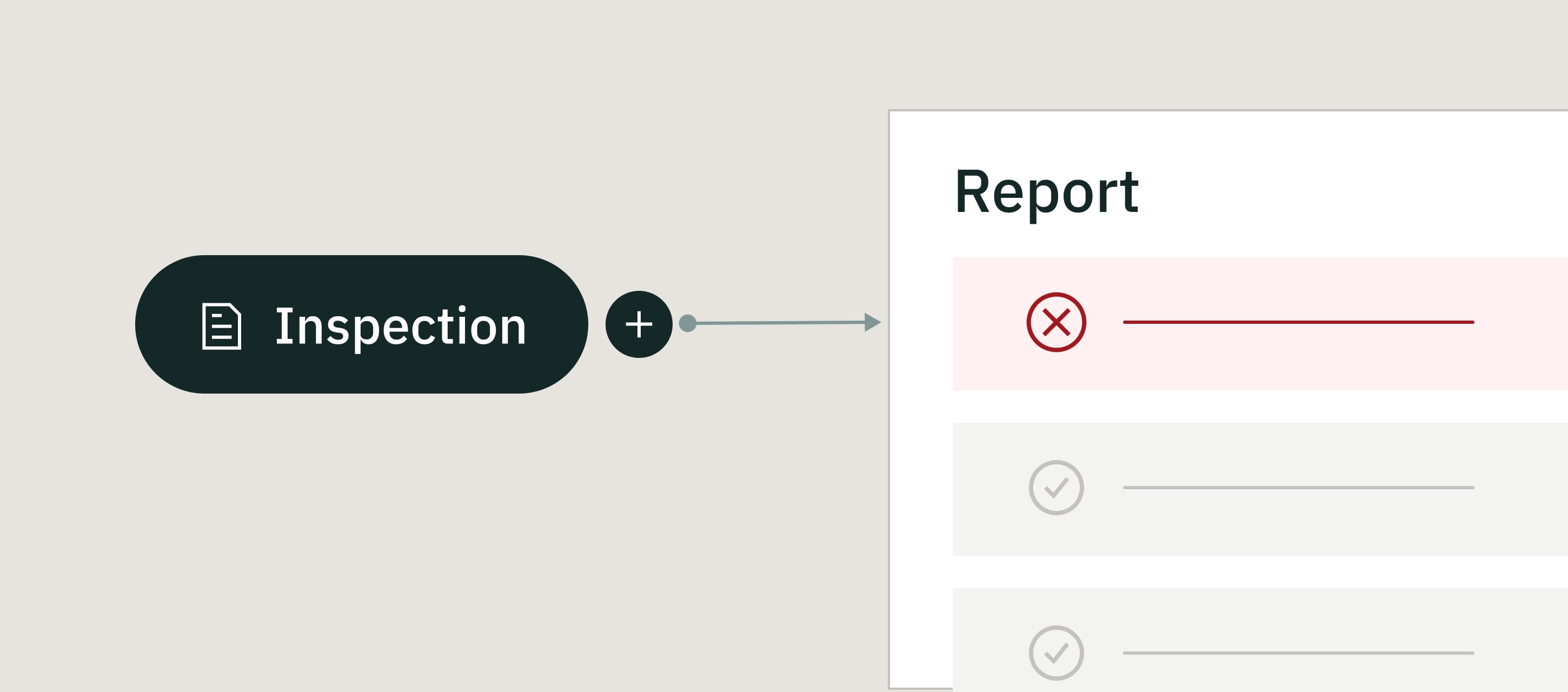
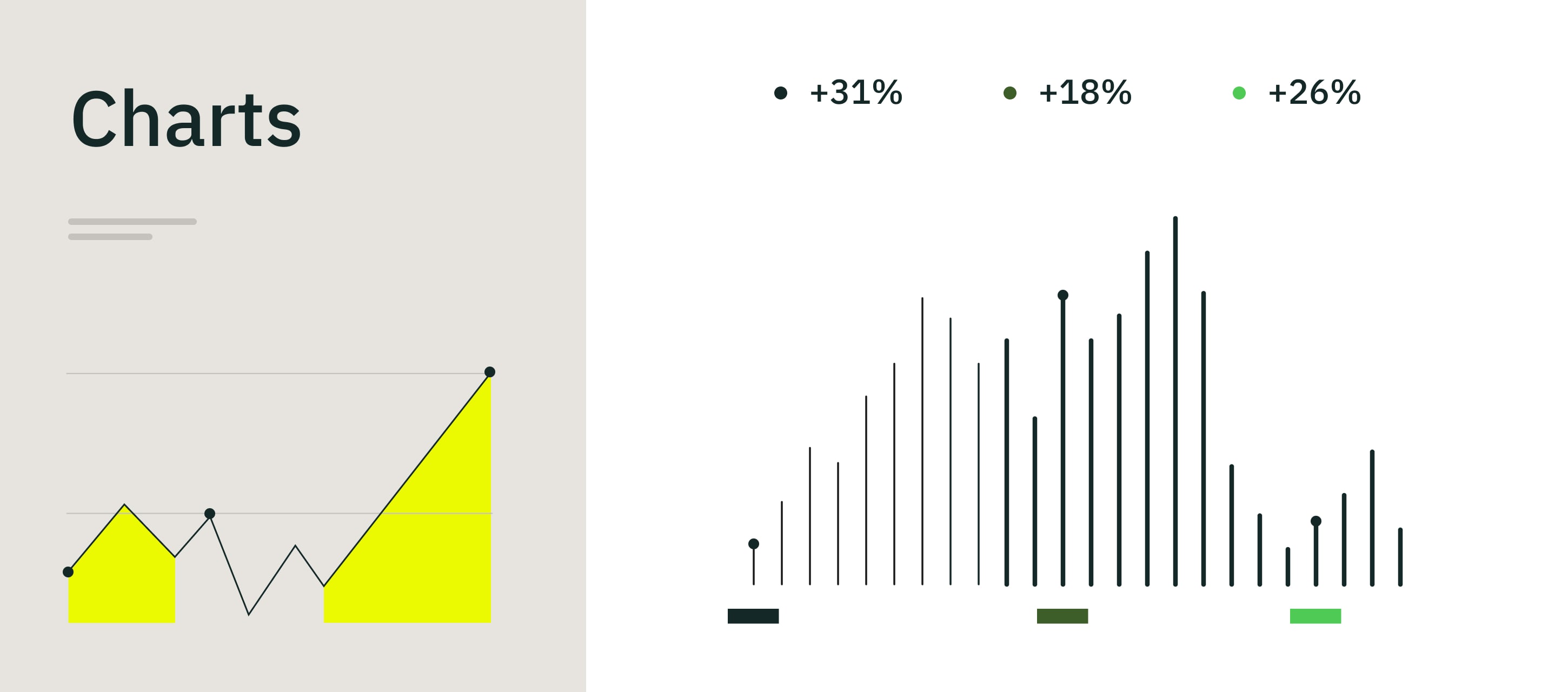
Fluix Charts is a feature that turns data from your reports into visual charts — like bar, column, or line charts — automatically.
Instead of scanning rows of numbers or exporting data into spreadsheets, you get a clear visual overview of what’s happening in your operations: progress, delays, trends, and recurring issues.
How it works:
- Your field team fills out forms and reports as usual
- Fluix collects that data in reports
- You create charts based on that data in just a few clicks
- Charts update automatically as new data comes in
KEY FLUIX CHARTS CAPABILITIES
- Real-time visual insights. See up-to-date results as soon as reports are submitted.
- Simple chart types. Use column, bar, or line charts to match the story you want to tell.
- One source of truth. Charts sync automatically with reports, so your visuals always reflect the latest data.
- Easy sharing. Export charts as images to share progress with stakeholders or customers.
- Performance comparison. See results across assignees, sites, assets, or time periods in one view.
Already using Fluix? See how Charts fits into your current setup. Activate Charts now >
WHAT YOU CAN DO WITH FLUIX CHARTS
Fluix Charts supports everyday operational questions, not just reporting for reporting’s sake. Here’s how teams like yours use it in practice.
1. Get a visual overview of what’s happening
- How many inspections are done, in progress, or overdue
- Which sites or assets need attention
- Where work is slowing down
2. Spot trends and patterns early
- Are incidents increasing month over month?
- Are certain issues showing up again and again?
- Is one team overloaded compared to others?
3. Prioritize issues and corrective actions
- Focus on the most common or severe problems first
- Allocate resources where they’re actually needed
- Support decisions with data, not gut feeling
4. Track task status and timeliness
- What’s on time
- What’s overdue
- Where follow-ups are getting stuck
5. Communicate progress
- Management and executives
- Customers
- Auditors and compliance teams
Need More Details about Fluix Charts?
Our team will show how they help with your inspection data
BENEFITS OF USING FLUIX CHARTS
Charts are most valuable when you manage multiple sites, teams, or assets and need clarity without manual reporting.
See the big picture faster. You don’t need to dig through reports to understand performance. Charts give you an instant overview.
Make data-driven decisions. Visual trends help you move from “I think” to “I know.”
Reduce manual reporting. No exporting, formatting, or rebuilding charts elsewhere. What you see is always up to date.
Keep everyone aligned. When everyone looks at the same visuals, conversations stay focused and productive.
WHAT CUSTOMERS SAY ABOUT REPORTING IN FLUIX
“The ability to automatically export form data has saved hours of my time. Now we can easily reference data to monitor effectiveness of service and aggregation of components within the renewables asset.” James Bird,Maintenance Engineer, RWE Renewables
“We have managers using Fluix for workload distribution, and we have datasets being captured in Fluix to allow quick reports on warranty and quote trends.” Brendan Tilling, Project Proposals Engineer, MULTIVAC
“Fluix gave us much greater control over the amount of time each report would require to complete.” Hannah Riley, Principal Conservator, Riley Textile Conservation
FLUIX CHARTS FAQ
What is Fluix Charts?
Fluix Charts is a feature that visualizes data from your reports into easy-to-read charts.
Who can create and manage charts?
Charts are typically created by admins or managers who work with reports and performance data.
Can I combine Charts with other Fluix features?
Yes. Charts work with data from reports, inspections, and Issue Reports.
Do charts update automatically?
Yes. When report data changes, charts update automatically.
Is Fluix Charts included in my plan?
Charts are available with the Pro plan.
LAST WORD
When your operations span multiple sites, teams, and assets, clarity becomes essential.
Fluix Charts helps you see what’s really happening, without digging through spreadsheets or building reports from scratch. It turns everyday field data into clear visuals that support better decisions, faster follow-ups, and smarter planning.
If you want more visibility into your operations and less time spent explaining numbers, Fluix Charts is built to help.