


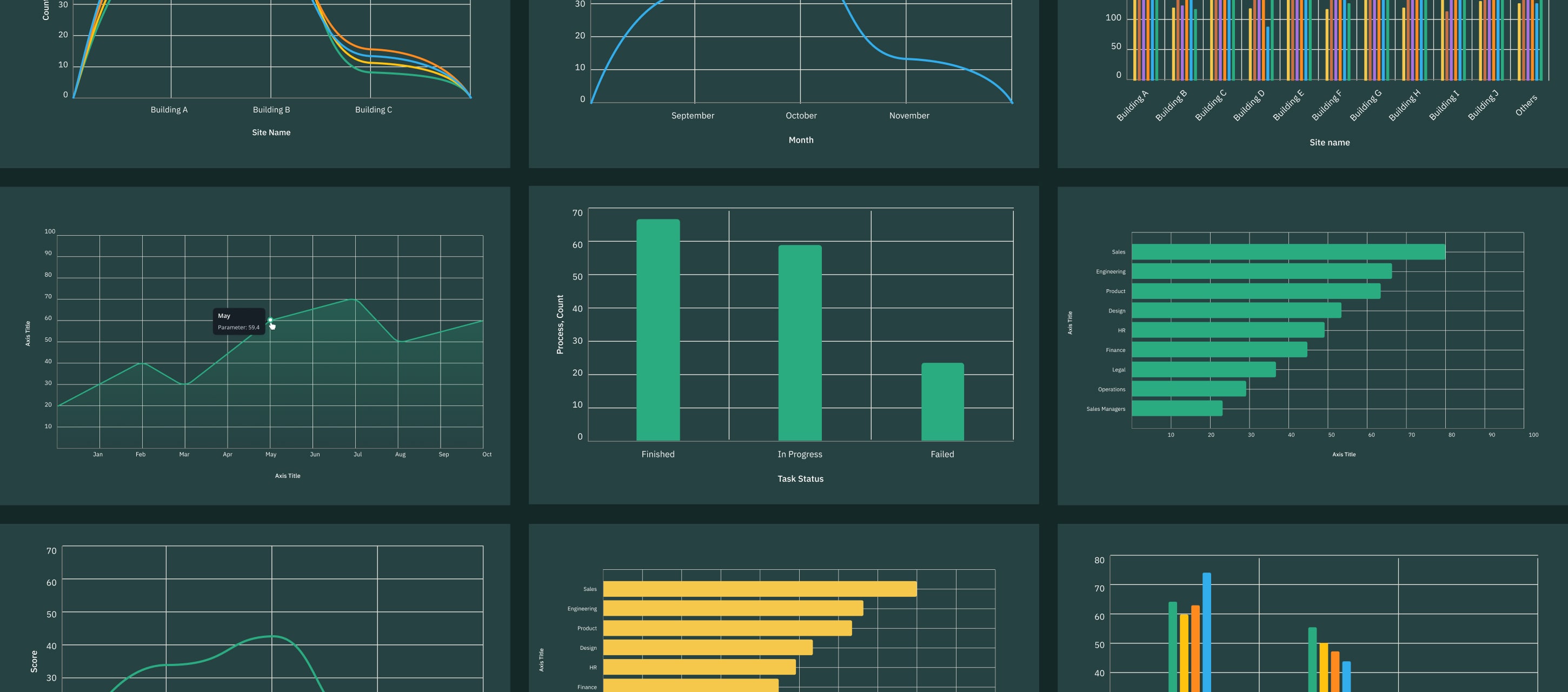
Charts is a functionality in Fluix Tasks designed to help you transform real-time field data into clear visual insights. With Charts, you can visualize team performance and make data-driven decisions more efficiently, all without manually analyzing spreadsheets or reports.
What Are the Key Benefits of Charts?
Charts enhance your daily operations by simplifying data interpretation and reducing time spent on manual analysis.
Let’s dive into the core benefits your team will get with Charts in Fluix, one step closer to Field Intelligence.
Visual Insights at a Glance:
Instantly visualize filtered data in Charts from the forms your field team fills out on-site.
Identify Patterns & Trends:
Spot recurring issues, seasonal peaks, or inefficiencies hidden in raw data from the field.
Real-Time Data Sync:
Chart results (views) update automatically as new form submissions arrive in Reports, ensuring your dashboards always reflect the most current field activity.
Analyze Incidents:
Visualize issue types, frequency, and severity to prioritize corrective actions.
Effortless Sharing:
Share clear visuals instantly during meetings, reviews, or customer updates.
Use Case Example: Field Performance Visibility
Imagine your field technicians complete work reports daily. Supervisors then need to track completion rates, delays, or recurring issues across multiple sites. With Charts, supervisors can:
- Visualize how many tasks each technician completes
- Compare task completion and delays across different sites or locations
- Spot recurring issues or equipment failures
Charts provide a clear visual way to analyze inspection data by different dimensions, such as status, asset, assignee, or site, and to compare trends over time (day, week, month, quarter, or year). This allows teams to quickly understand performance.
How to Create Charts in Fluix
Charts are created from data in Dashboards.
Step 1: Define which data you would like to visualize
- Navigate to Fluix Tasks → Dashboard section.
- Select the board that contains the data you want to visualize via the All Dashboards button, or create a new board.
- Then, click Add Chart.

Step 2: Select a Chart Type
- Column – vertical bars for comparing values across categories.
- Bar – horizontal bars for comparing aggregated values.
- Line – data points connected by a line to show progression.

Step 3: Configure and Add Your Chart
Each chart consists of the following configuration elements:
- Dimension – the category or grouping of your data (e.g., team name, date, site).
- Metric – numeric field you want to measure (e.g., task count, duration, number).
- Aggregation – determines how your metric is calculated in the chart. Based on the metric you select, the following aggregation options will be available: count, sum, average, minimum, maximum, and percentage.
- Breakdown by – Allow you to split your chart data into subcategories, so you can see how different groups contribute within each part of your chart. You can choose any text-based field that isn’t already used as your Dimension.
Example: If your chart is grouped by month, adding a Breakdown By Inspector will show how each inspector’s results are distributed within every month.
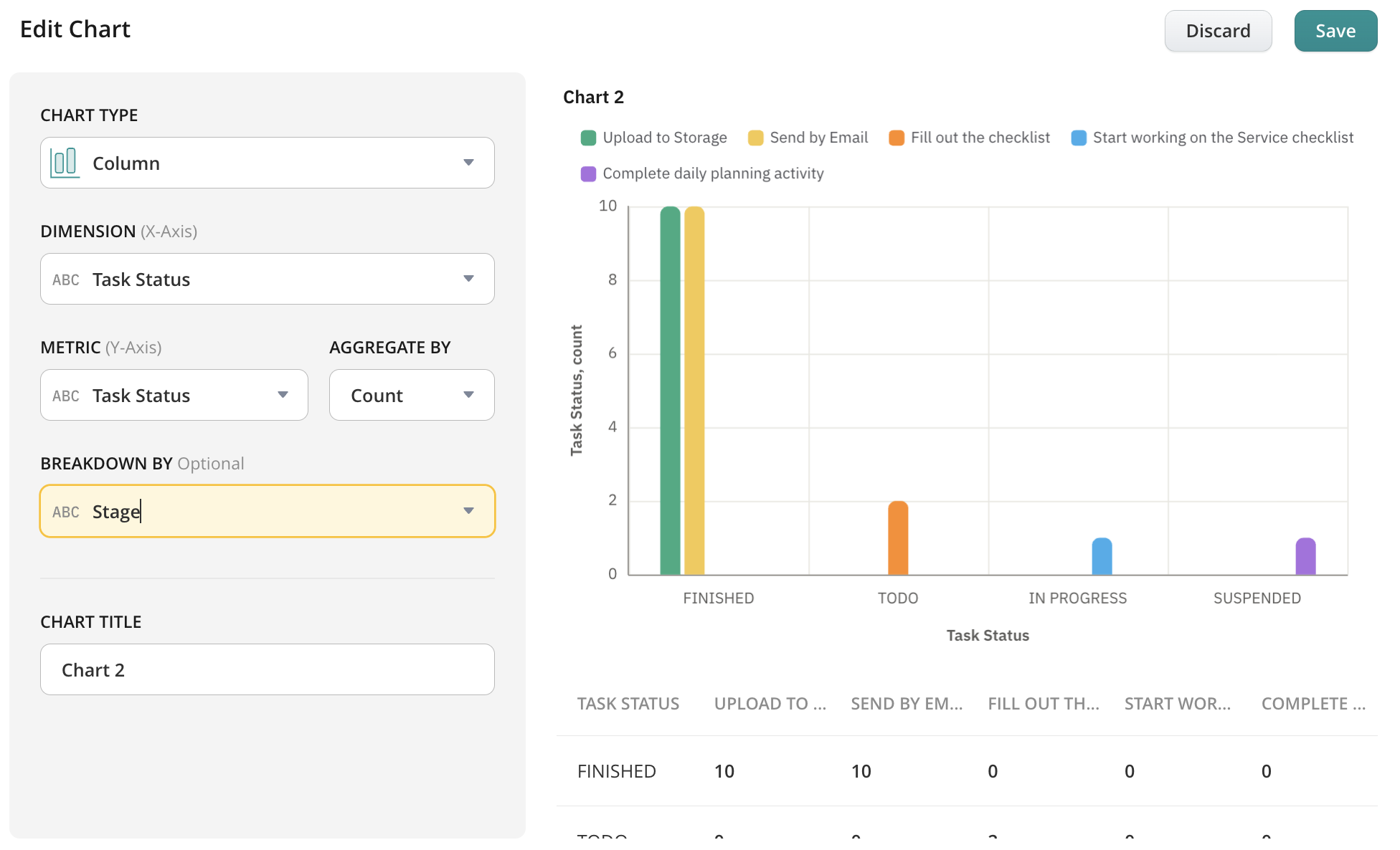
Note: Breakdown By is available when your report includes at least one text-based field (other than Process Name or Form Name). If your report only contains numbers or dates, this option may not be available.
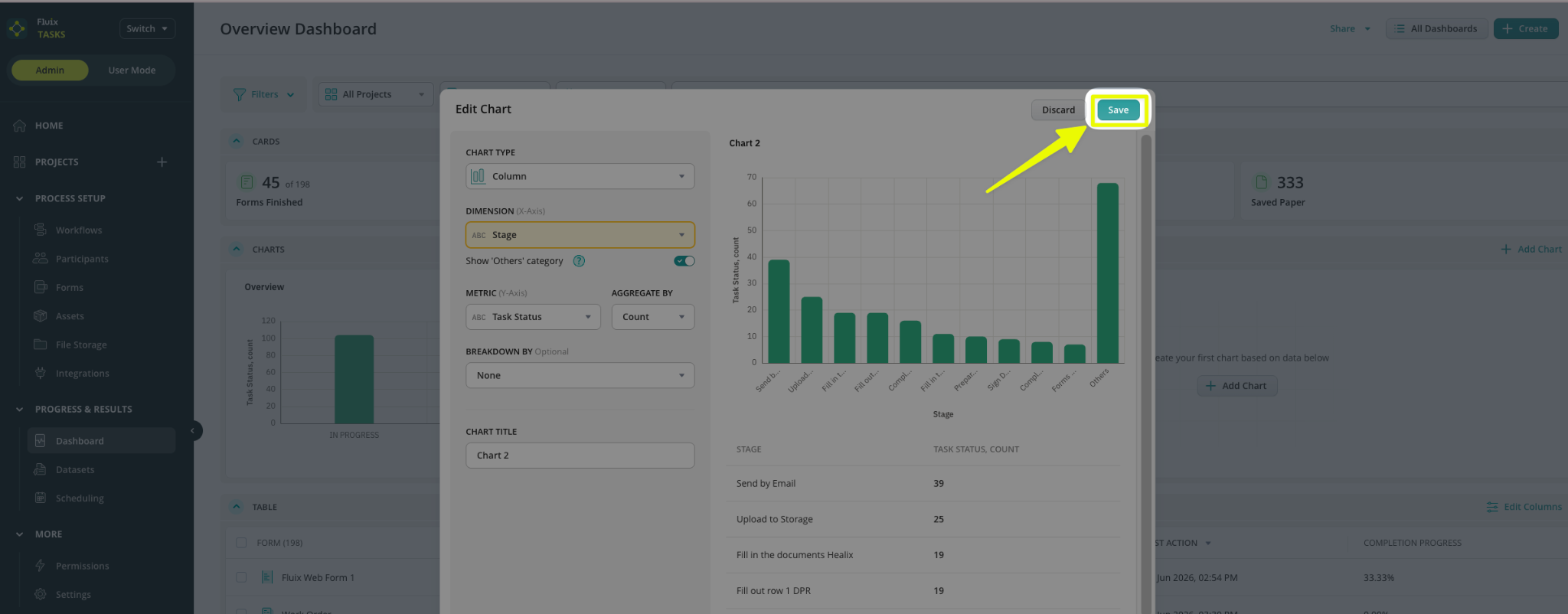
Once your chart is configured, set a Chart Title and click “Save“.
Drill Down in Charts in Fluix Tasks
As an admin, you can drill down into chart bars, columns, and segments to see even more detailed data. Drill-down can be accessed directly from the chart in the Dashboard section of your Admin Portal:
- Navigate to the Chart in the Dashboard section
- Click on the chart element

When the visual element is clicked on (for example, a chart bar “In Progress”), the contextual menu will be displayed with the options:
- View Details – the option that will open the drill-down view with underlying records.

- Download Data (CSV) – will export the underlying data for the selected chart element (Note: not available right now, will be included in one of the next releases)
After selecting the View Details button, a drill-down view opens, and the report table is displayed in a filtered state. The drill-down table contains all the same columns as in the Dashboard table:
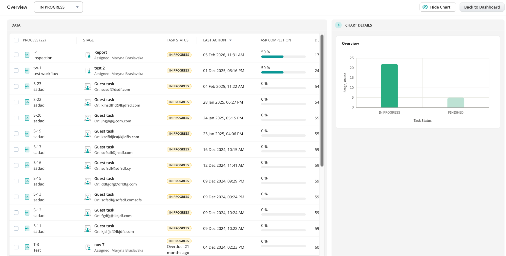
The drill-down view consists of two main areas:
- Data (left side) reflects the list of records corresponding to the selected chart value.
- Chart Details (right side) displays the chart and all applied filters (if added).
By default, the Chart Details Panel is always shown. However, it can be hidden by clicking the Hide Chart button and shown by clicking the Show Chart button, as shown below:

The chart remains fully interactive within the drill-down view. Clicking a different bar, column, or point dynamically updates the workspace:
When you open a chart’s drill-down view, the Data Panel on the left shows you the exact list of items behind the visual chart. Here is how to navigate the panel and manage your records:
- The title at the top of the table matches your original Chart card.
- Use the filtering menu to switch between different chart categories on the fly. Clicking a category updates both the chart highlight and the table list instantly

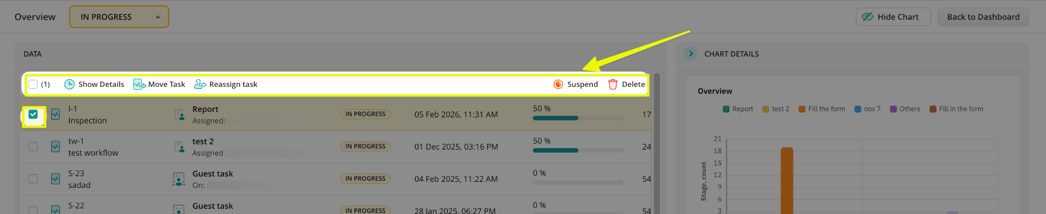
Additionally, you don’t need to leave the drill-down view to manage your team’s work. Simply check the box next to one or more processes to reveal your action menu (Show Details, Move Task, Reassign Task, Suspend, or Delete):
Managing Charts
By clicking on the three-dots menu, you can manage your chart and perform several actions, including:
- Delete
- Remove the chart from the Reports
- Edit
- Export as Image
Exporting the chart as a PNG or JPEG file for use in presentations or documentation will be added in the upcoming release.
If you have any questions, contact our support at support@fluix.io, and we’ll be happy to help.