


Fluix Tasks
Introducing Dashboards
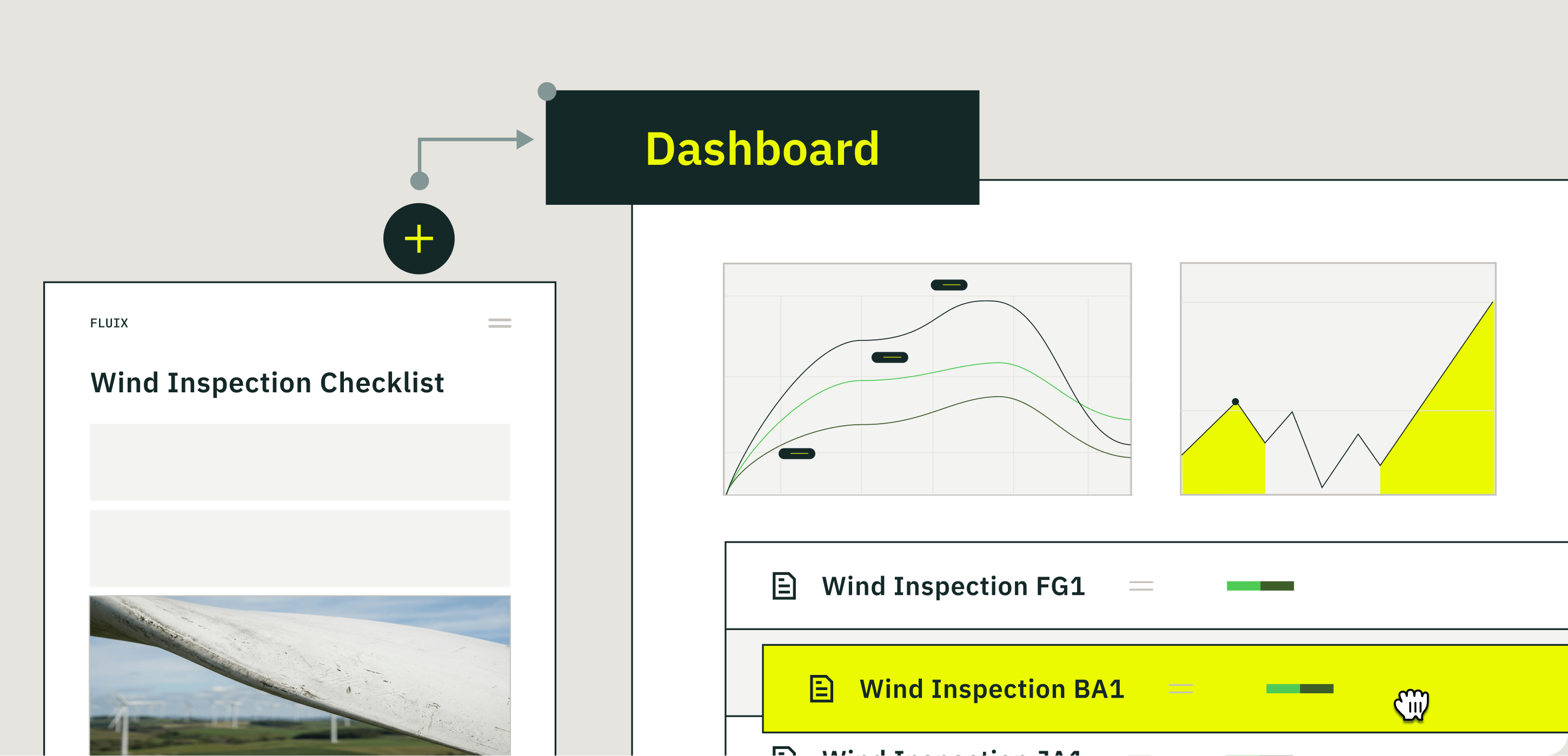
What was Activity Status is now Dashboards — a real-time operations intelligence hub built directly into Fluix. See workflow health, team performance, and key KPIs the moment they change — and act on them faster.
With Dashboards, you can:
- Build custom charts from any process or form data across your operations
- Benchmark performance by comparing results across teams, sites, and locations
- Connect the dots between form responses and workflow outcomes to identify what’s actually driving results
Share any Dashboard with teammates, stakeholders, or clients via a live link that always reflects current data. To get started, navigate to Admin Portal → Dashboard.
New Chart Types: Line & Bar Charts
In addition to column charts, you can now build Line and Bar charts — giving you more flexibility to present data in the format that makes analysis clearest.
- Line charts — ideal for tracking trends over time (e.g., inspections per week, average resolution time by month)
- Bar charts — ideal for comparing categories with longer labels (e.g., incidents by site, inspection count per technician)
If you have questions or need help getting started, reach out to us at support@fluix.io, and we’ll be happy to help.